In-park information screens
PortAventura Park showed waiting times on LED boards and listed closed rides on strips an operator changed by hand. I designed the digital screens that replaced them, themed for every area of the park, and I still own them.
PortAventura World
- Client
- PortAventura World
- Role
- Product designer, project owner
- Team
- Design lead, e-commerce stakeholder, external development team
- Period
- October 2023 – present
- The problem
- Waiting times lived on fixed LED boards that only listed the big rides, and closed rides were posted by hand every morning. Smaller rides had no queue because nobody knew they were there.
- What I did
- I ran the research in the park (observation, interviews with guests, sessions with operators and a benchmark of other parks) and designed every screen family, from 24-inch ride entrances to 75-inch area totems.
- The outcome
- Themed screens across the park that show every ride with a queue, in four languages. The project led to my hire, and I've owned and improved the screens since.
PortAventura Park is split into themed areas, and each one tells its own story: a Chinese empire, the Far West, a Mediterranean fishing village. I designed the digital screens that tell guests what’s happening in each of them: how long the queues are, which shows are on next and where to eat nearby. It was my first project at PortAventura. I ran the research, designed every screen, and I’ve owned them ever since.
The problem
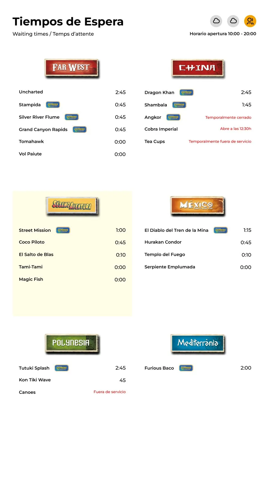
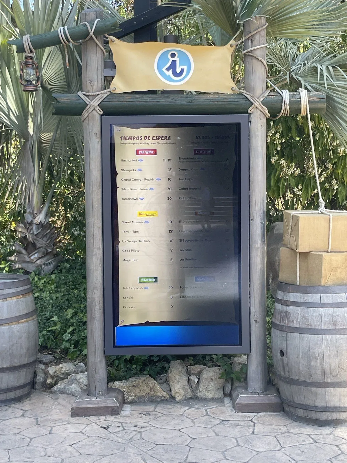
Before these screens, the park showed waiting times on LED boards next to the big rides. They listed a fixed set of mostly major attractions, with the time in hours and minutes. Closed rides were posted on a separate board, as name strips that an operator changed by hand every morning.
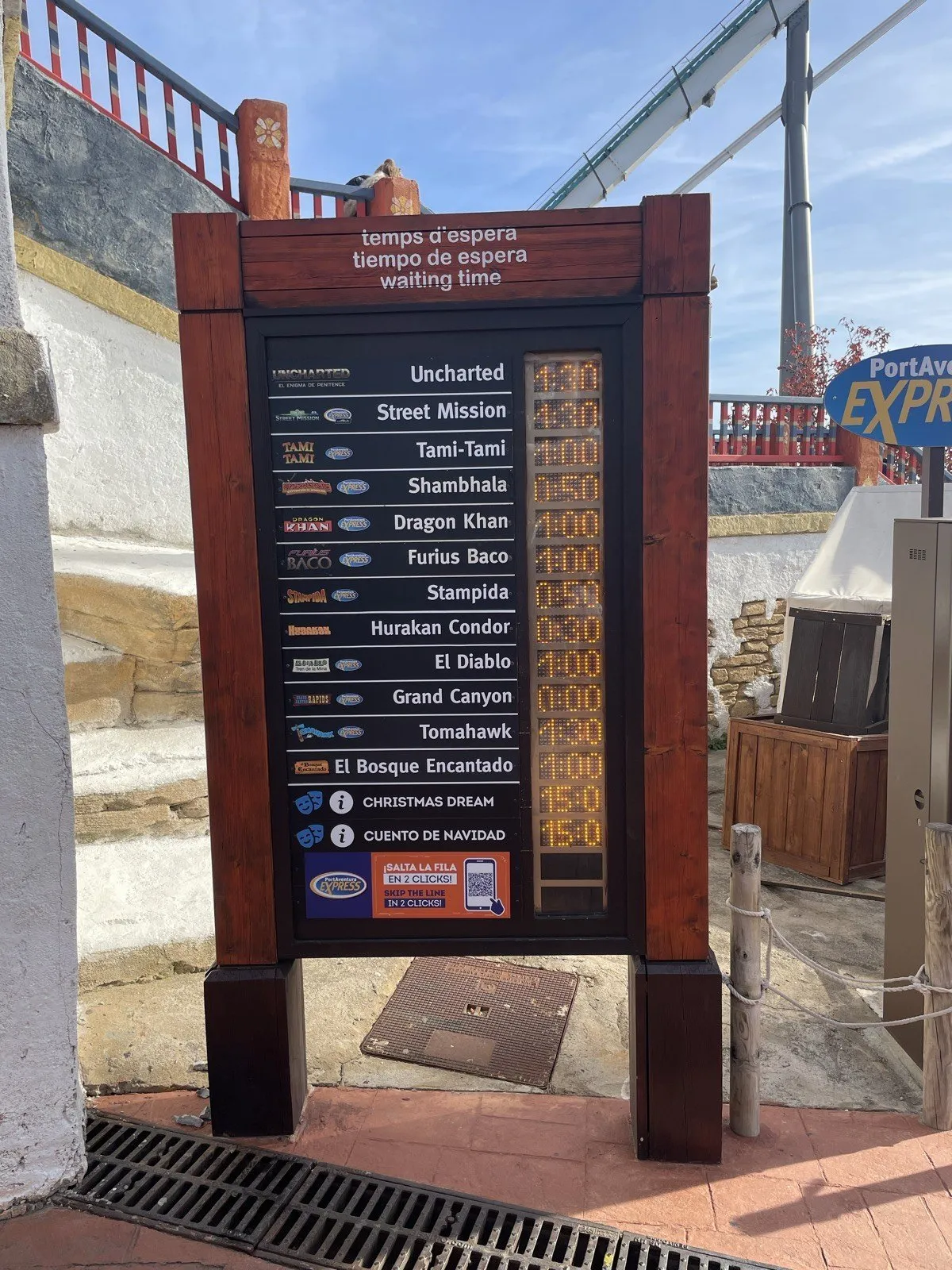
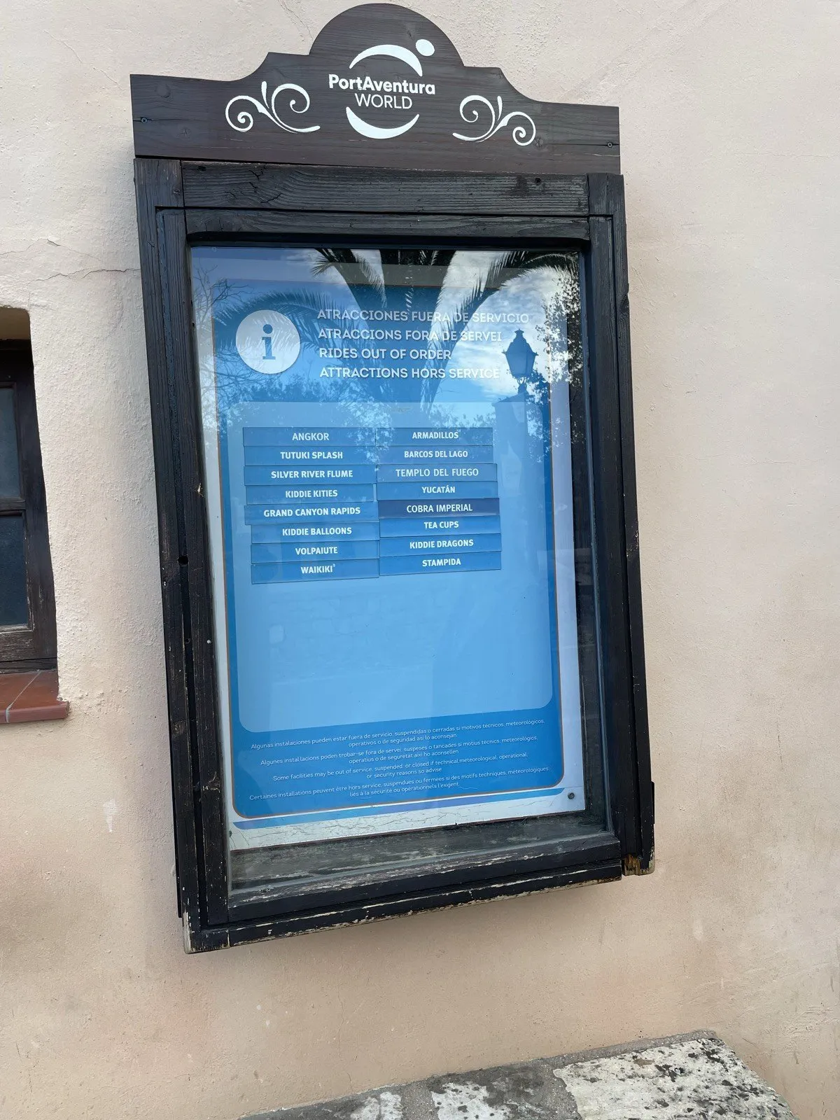
On busy days the queues built up on the major rides, while the smaller ones stayed quiet. When we asked why, the answer was simple: guests didn’t know those rides existed, where they were, or whether they were worth the walk. PortAventura measures the waiting time of almost every ride that can have a queue, and the boards showed only a handful of them.
How I got there
Research and design ran from October 2023 to January 2024. I worked with the design lead of the digital team, and the project was commissioned and approved by a stakeholder from the e-commerce team.
We spent many days in the park. We watched how guests read the old boards and planned their next move, ran short interviews and surveys on the spot, and held sessions with the ride operators, who knew the day-to-day problems best: keeping waiting times in sync, a ride going into maintenance mid-morning, another one closed for the whole day.
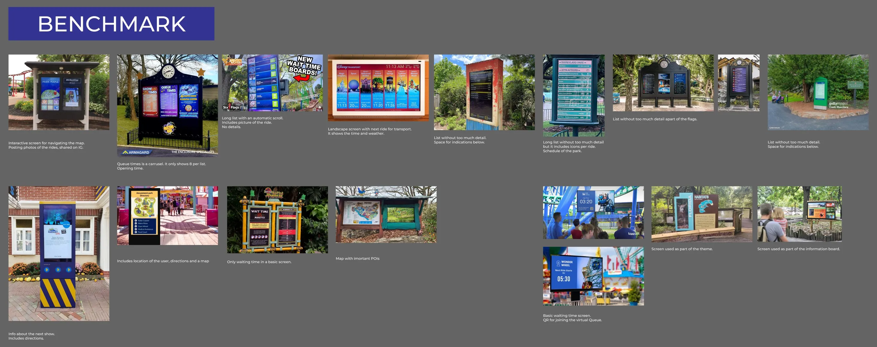
I also benchmarked about twenty screens from other parks, including Europa-Park, Parc Astérix and Walt Disney World. Most of them used a large picture per ride and gave little room to the smaller attractions or their waiting times.
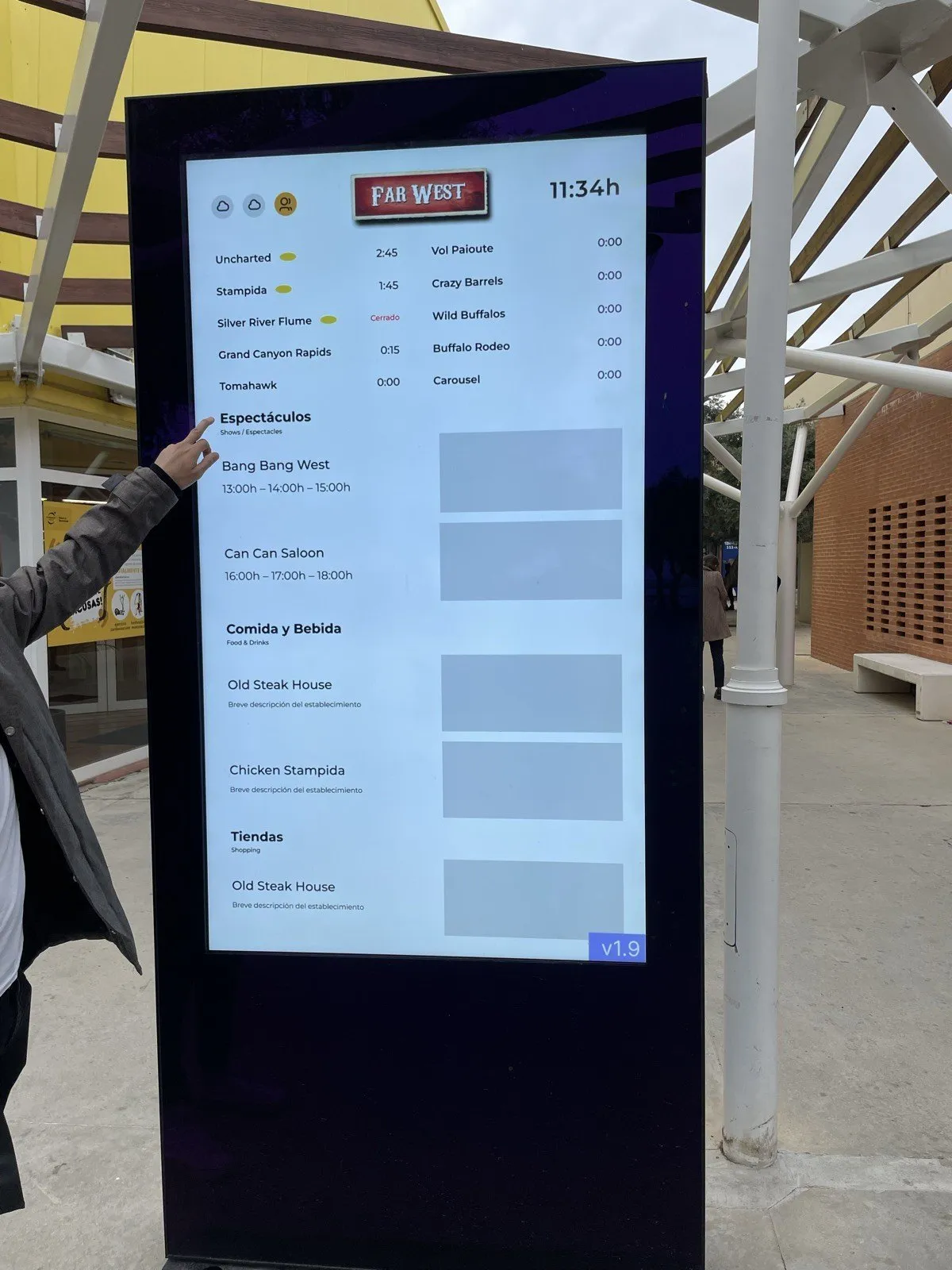
I reviewed each wireframe version with the stakeholders and noted what it tried, what they approved and what was still open. I tested them on provisional screens in the park, because the final hardware wasn’t installed yet.
Constraints
The screens had to work in four languages at once (Spanish, Catalan, English and French), because a screen can’t know who’s standing in front of it. They came in three formats: 24-inch screens at ride entrances, 75-inch vertical totems in each area and 75-inch horizontal screens for the whole park.
Every area has its own theme, and the park cares a lot about keeping it. The screens had to look like part of Far West or China, and they still had to be readable from a distance, in daylight, in a few seconds.
The data came from live systems. A ride could go from open to a technical stop in the middle of the morning, and the screen had to catch up within minutes.
Decisions
Organise each screen around the area you’re standing in
The observation changed the plan more than anything else. Guests discover the park area by area. They spend the morning in Mediterrània or Far West, find out what’s on around them, and rarely cross from one end of the park to the other.
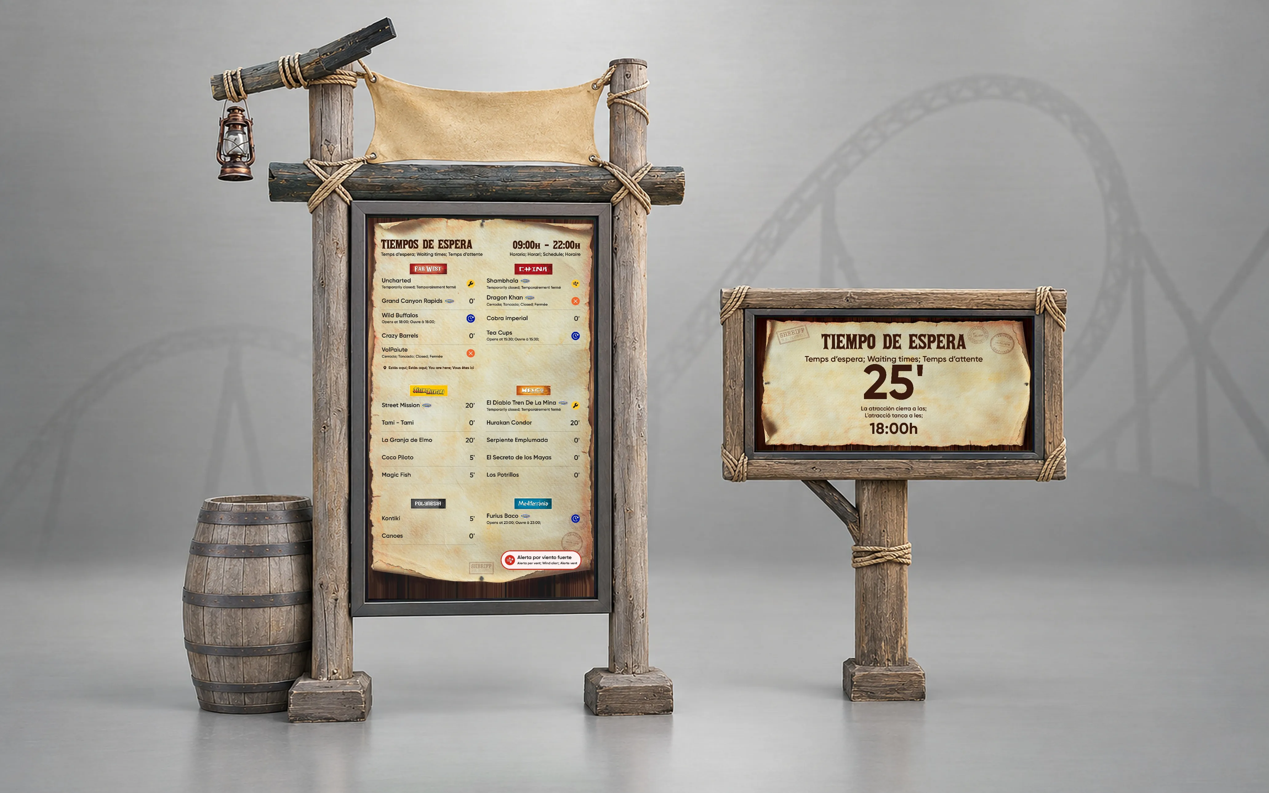
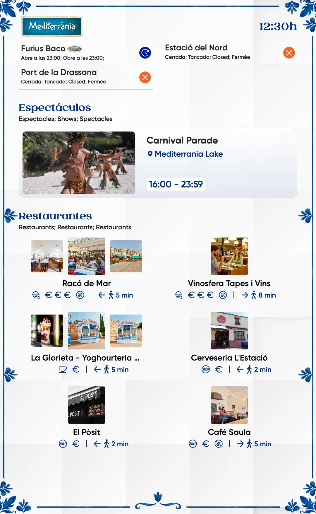
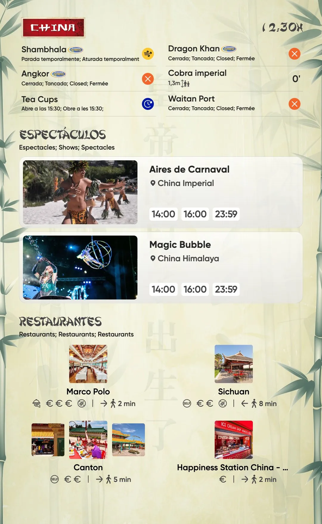
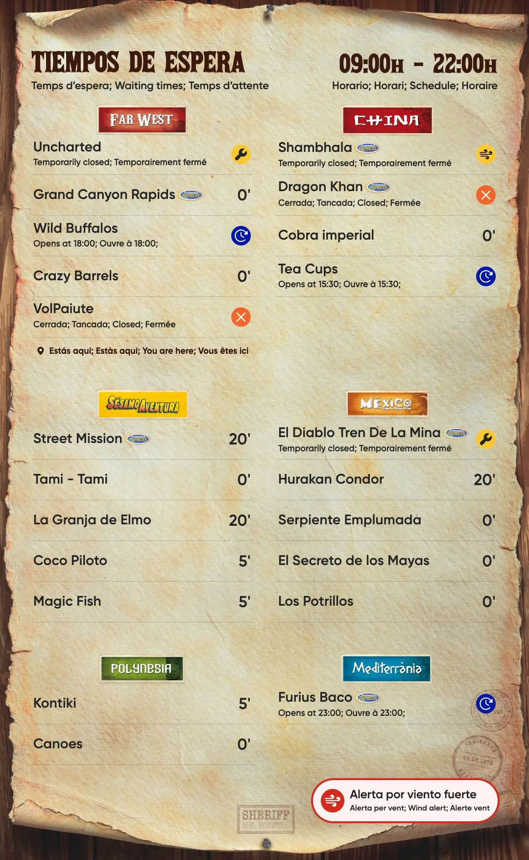
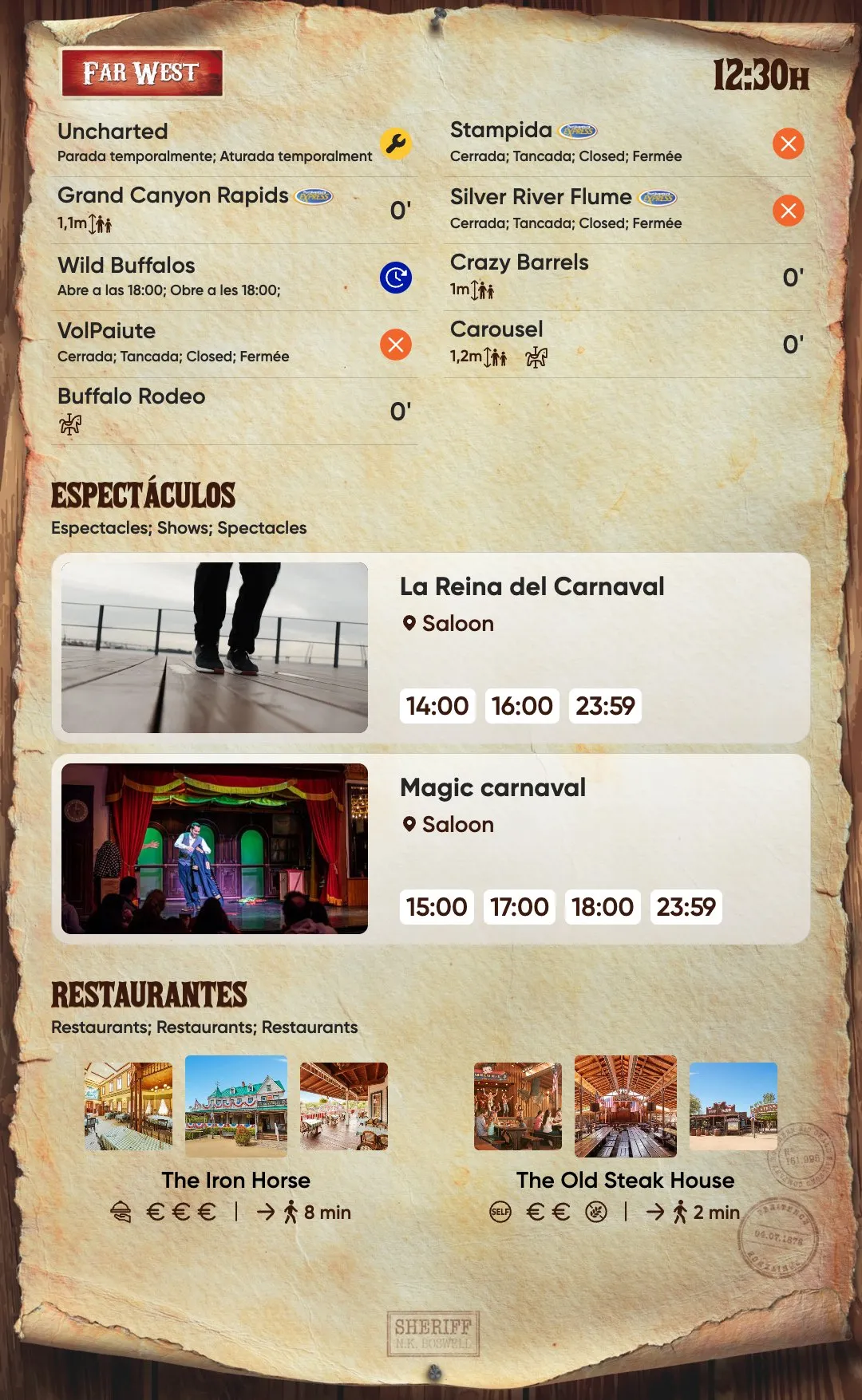
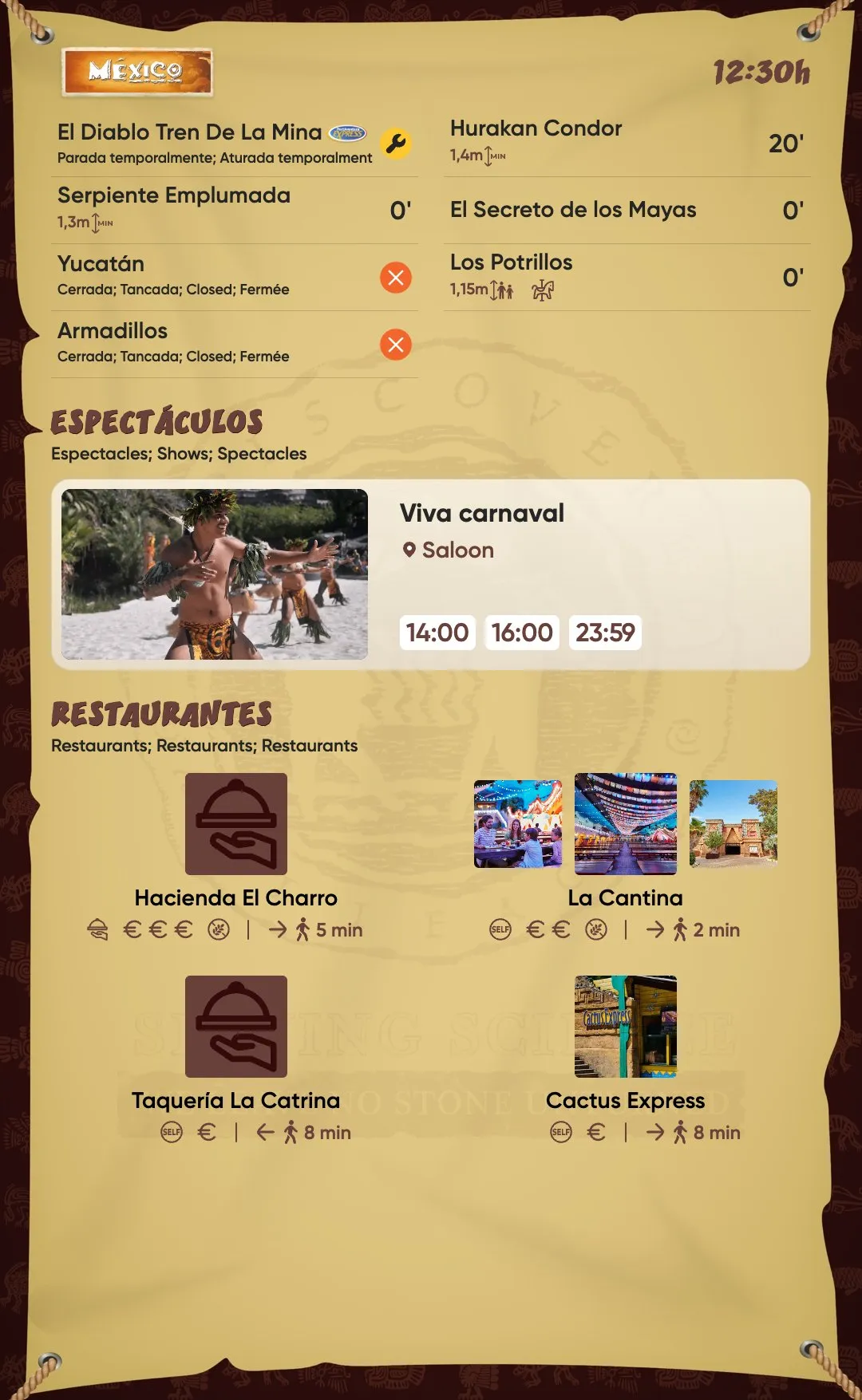
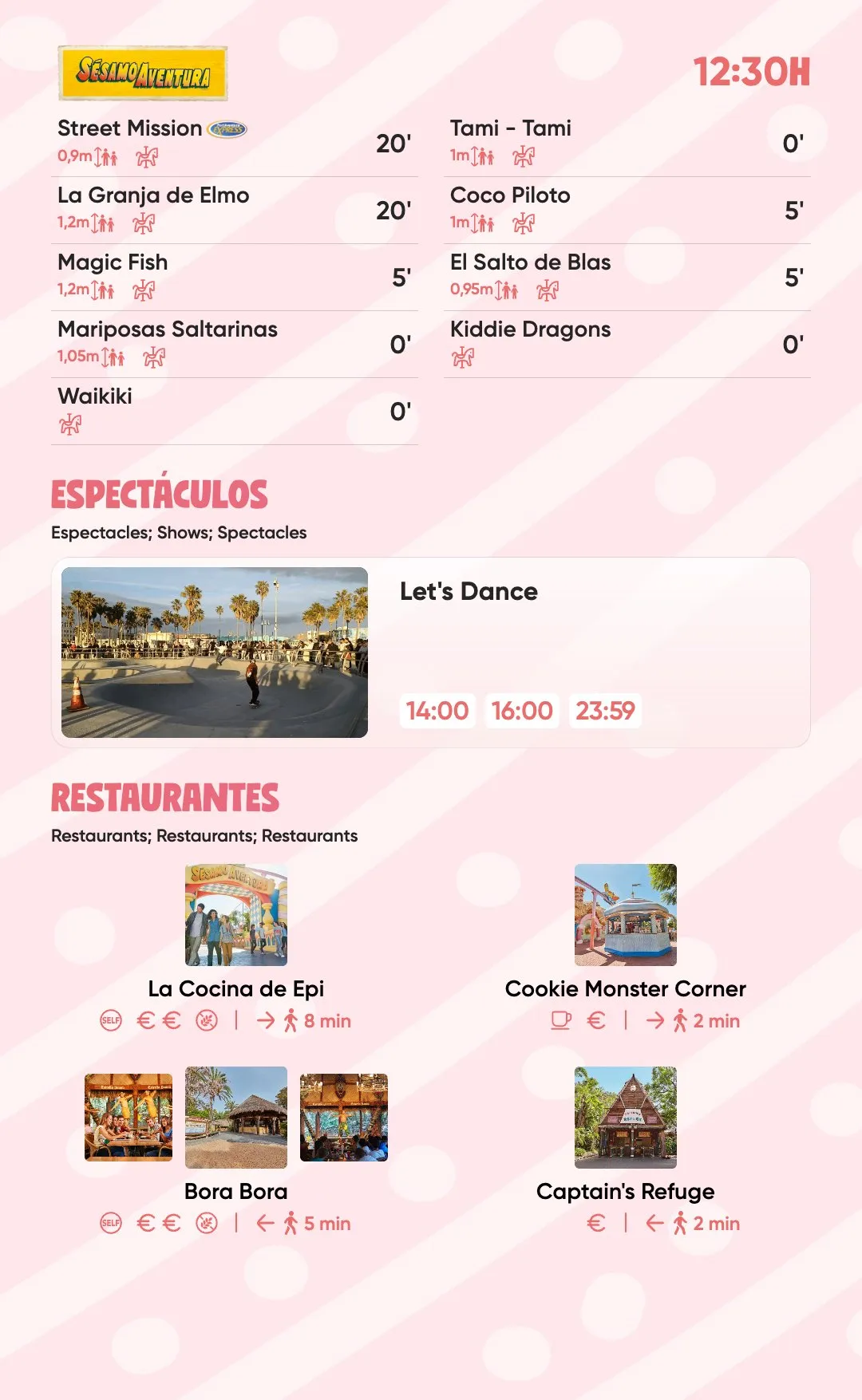
So I designed two views for the vertical totems. Focus shows only the area you’re in: its rides, its next shows and the restaurants nearby, with the walking time and direction to each one. Global shows the waiting times for the whole park, grouped by area, with a “You are here” marker. Once we saw how people moved, the restaurant and show sections became far more important than we’d first thought.
Show every ride at the same level
My first designs followed the benchmark and showed only the major rides, with the idea of giving each one a picture, as other parks do.
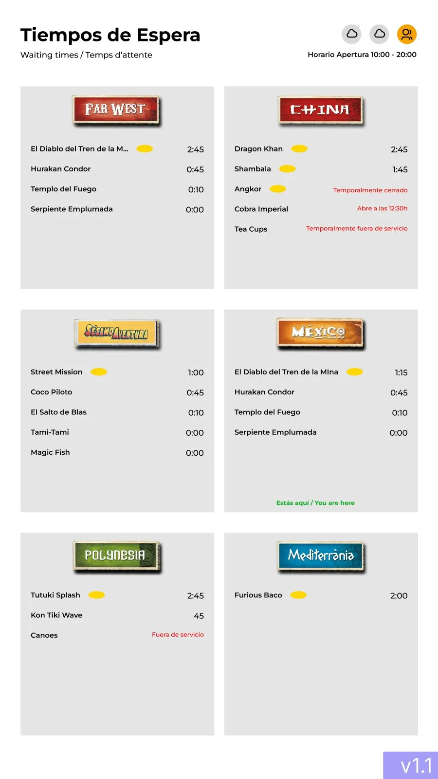
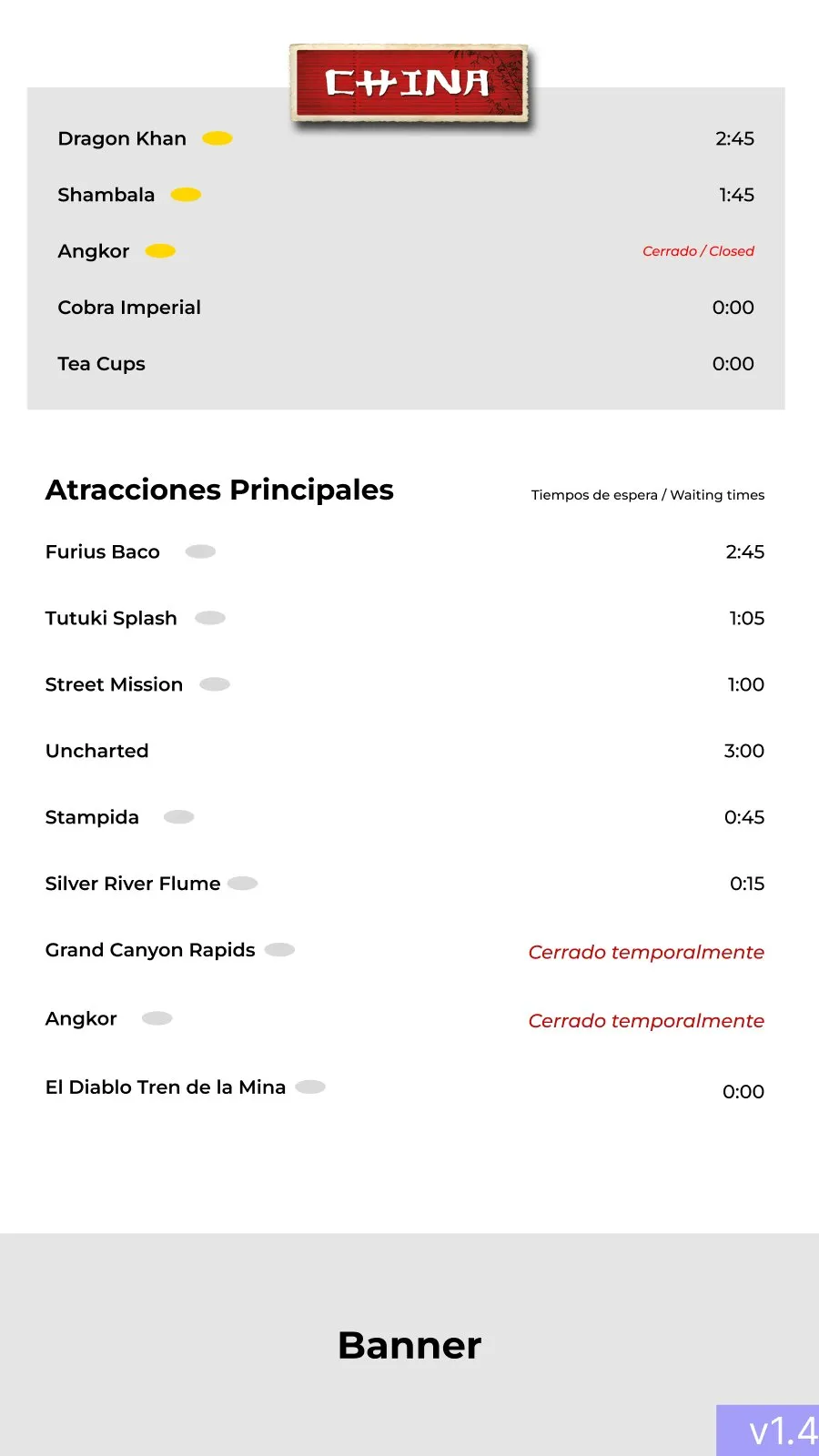
The research pointed the other way. The smaller rides interested plenty of guests, and they only stayed empty because nobody could see them. The stakeholders pushed for the same thing, even more than the guests did. I gave up the big pictures and put major and secondary rides in one list, at the same level, so the offer looks bigger and a 10-minute ride is as visible as a 90-minute one.
Theme the titles, keep the data plain
Each area has its own display typeface, from the brush strokes of China to the wanted-poster letters of Far West, plus its own background and artwork. I kept those for titles only. Ride names, waiting times and every detail use Gilroy, a very legible sans serif that already belongs to the PortAventura brand.
That split let each screen belong to its area while the information stayed readable from across a path. It also gave development a clear rule: one theme file per area, the same layout underneath.
Let the place decide the layout
We studied where each screen would stand and everything around it. Some are read against the light, some are read from far away, like the one at the park entrance. Location decided the type scale, whether a screen could play video and how many shows fit on it.
Say “temporarily”, and say when it opens
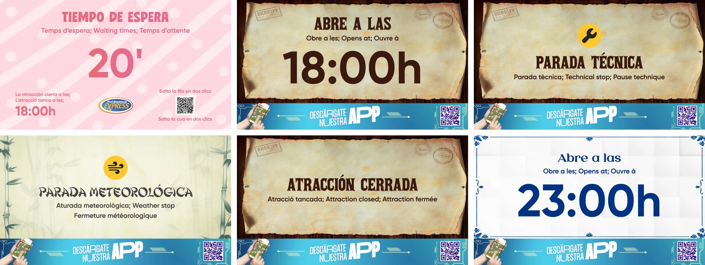
A ride that stops is bad news, and the operators and stakeholders wanted it handled carefully. I wrote the states to sound temporary and to look ahead. In the lists, a weather stop and a technical stop share the same line, “Temporarily closed”, and only the icon tells them apart; the ride’s own screen names the reason. A ride that hasn’t opened yet says “Opens at 11:00”, or “Opens soon” when an operator marks it as about to open. Only a ride closed for the whole day uses the alert colour.
Result
The screens went live in 2024 across PortAventura Park: ride entrances, area totems and park-wide screens, each one themed for its area and showing every ride that has a queue, updated live from the park’s systems.
The project also changed my own story. I designed it under a fixed engagement that ended at handoff, and it’s the reason PortAventura hired me in May 2024. I’ve owned the screens ever since.
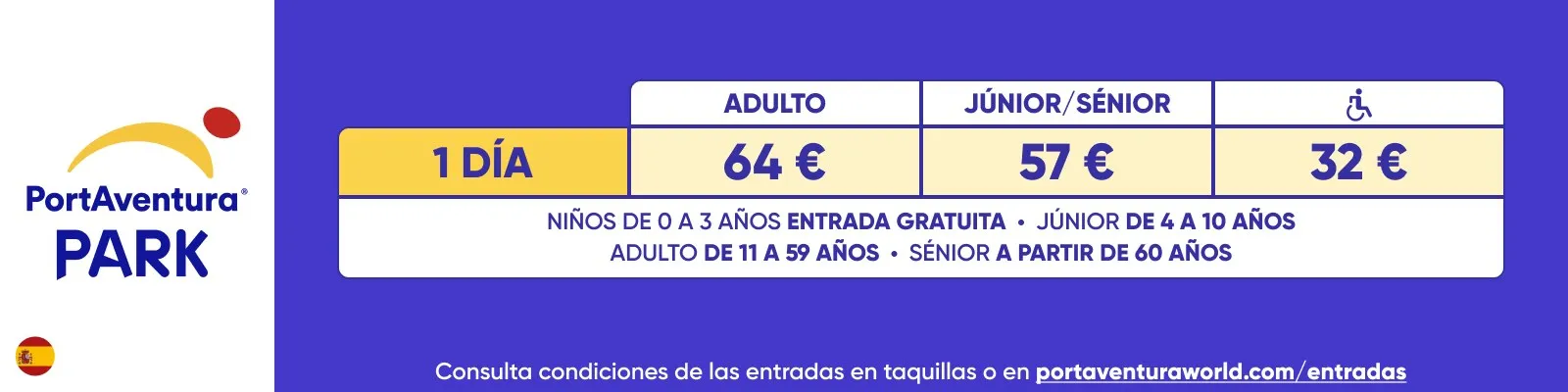
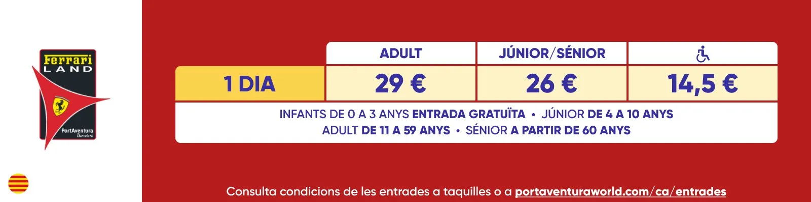
That meant going back to the park to watch them in use. In 2025 I designed the screens at the park entrance, with ticket prices and Express passes for the three parks, and the hotel screens, with the day’s opening hours, rides closed today and the weather by the hour.
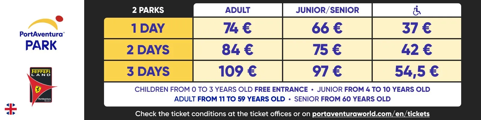
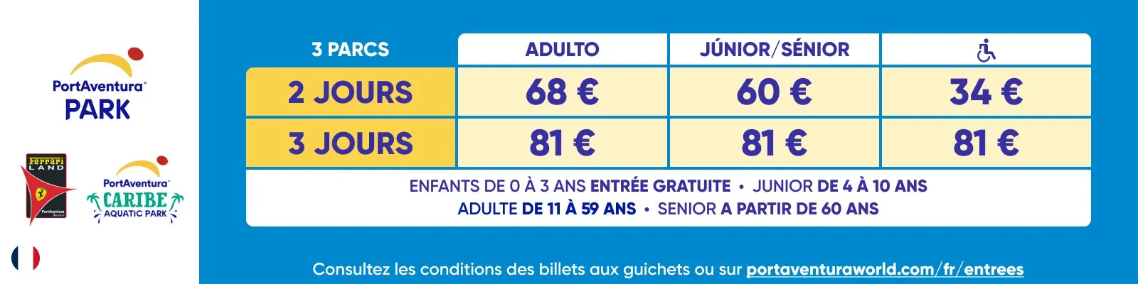
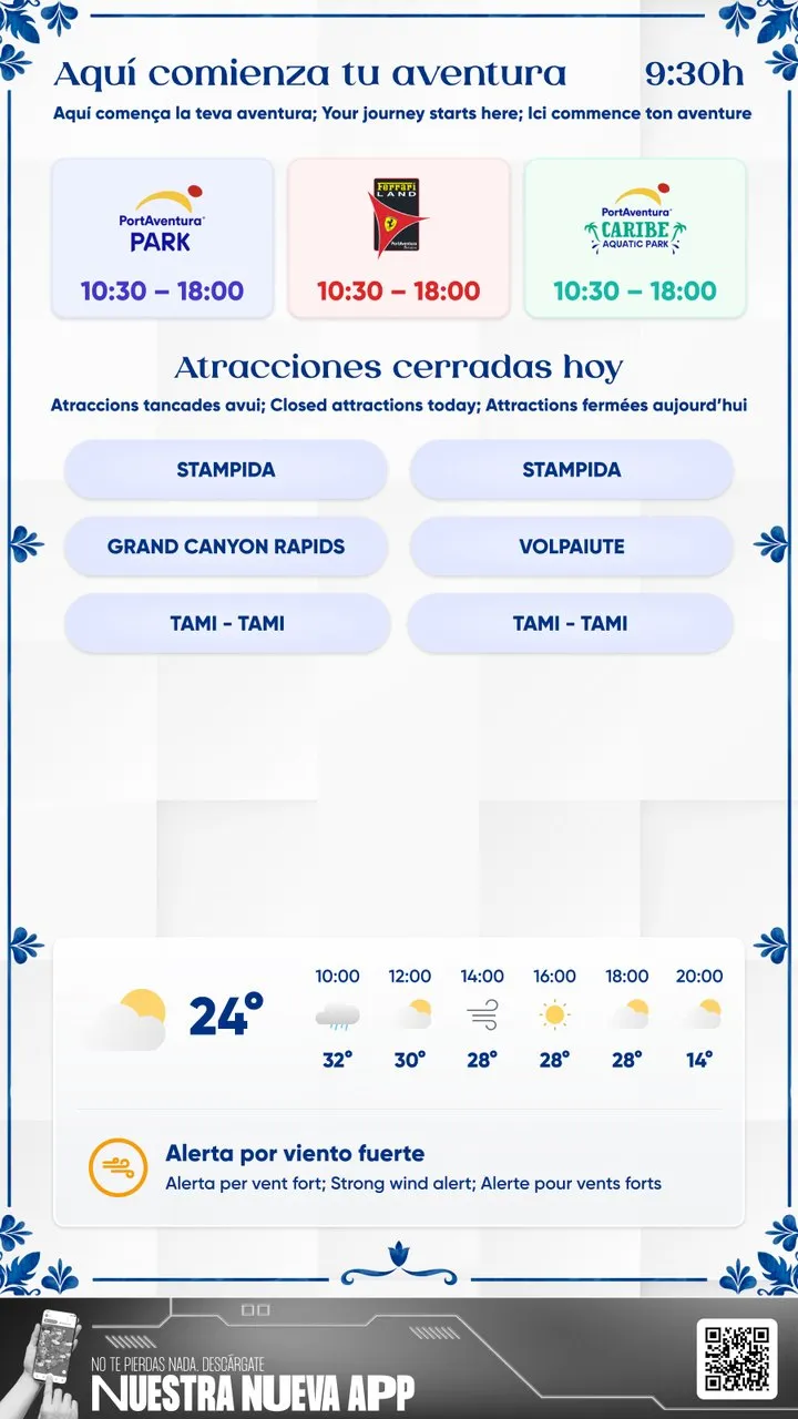
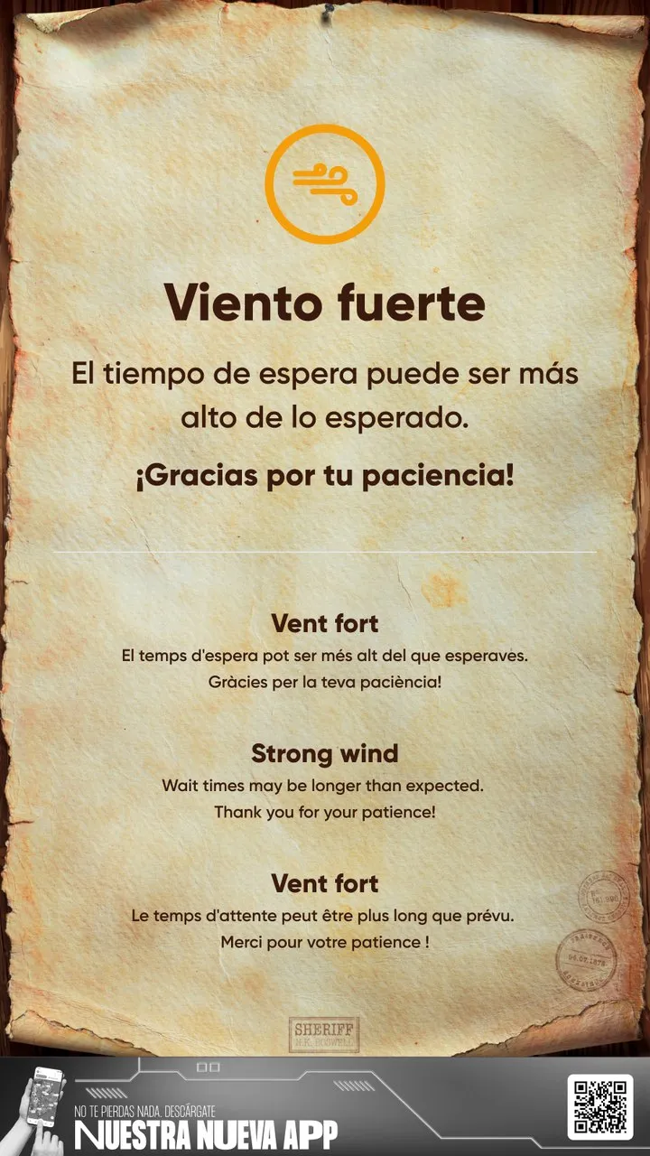
Later research also changed the time format, from hours and minutes to plain minutes. In April 2026 I went further and coded a round of improvements myself, from what I’d seen in the park: new icons, an alert colour for closed rides and layouts tuned for the real screens. I also fixed problems nobody had caught on a desk: the screens run an old version of Chromium, the park’s Wi-Fi is slow, and SésamoAventura’s typeface had broken digits that cut off the opening hours.
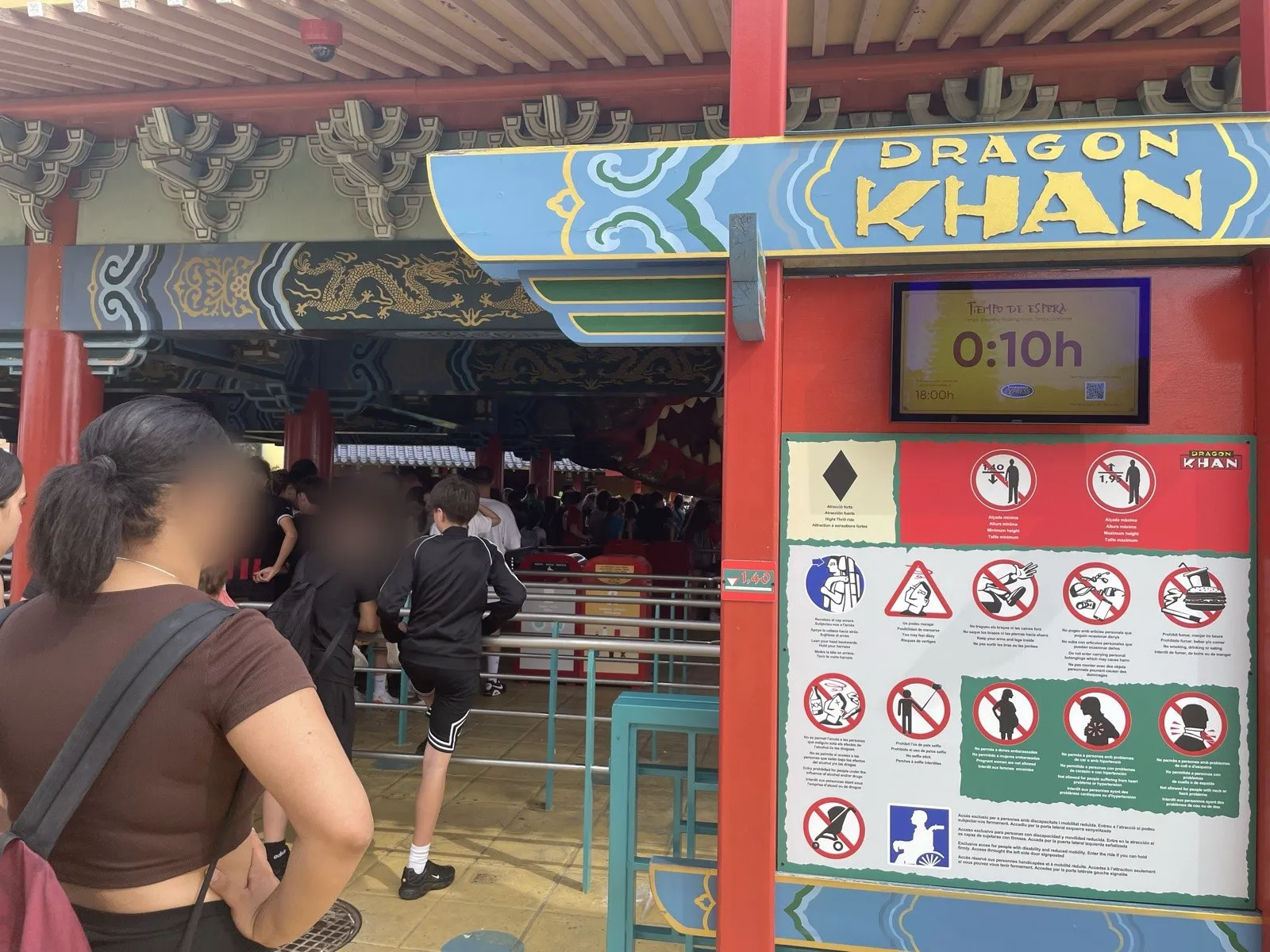
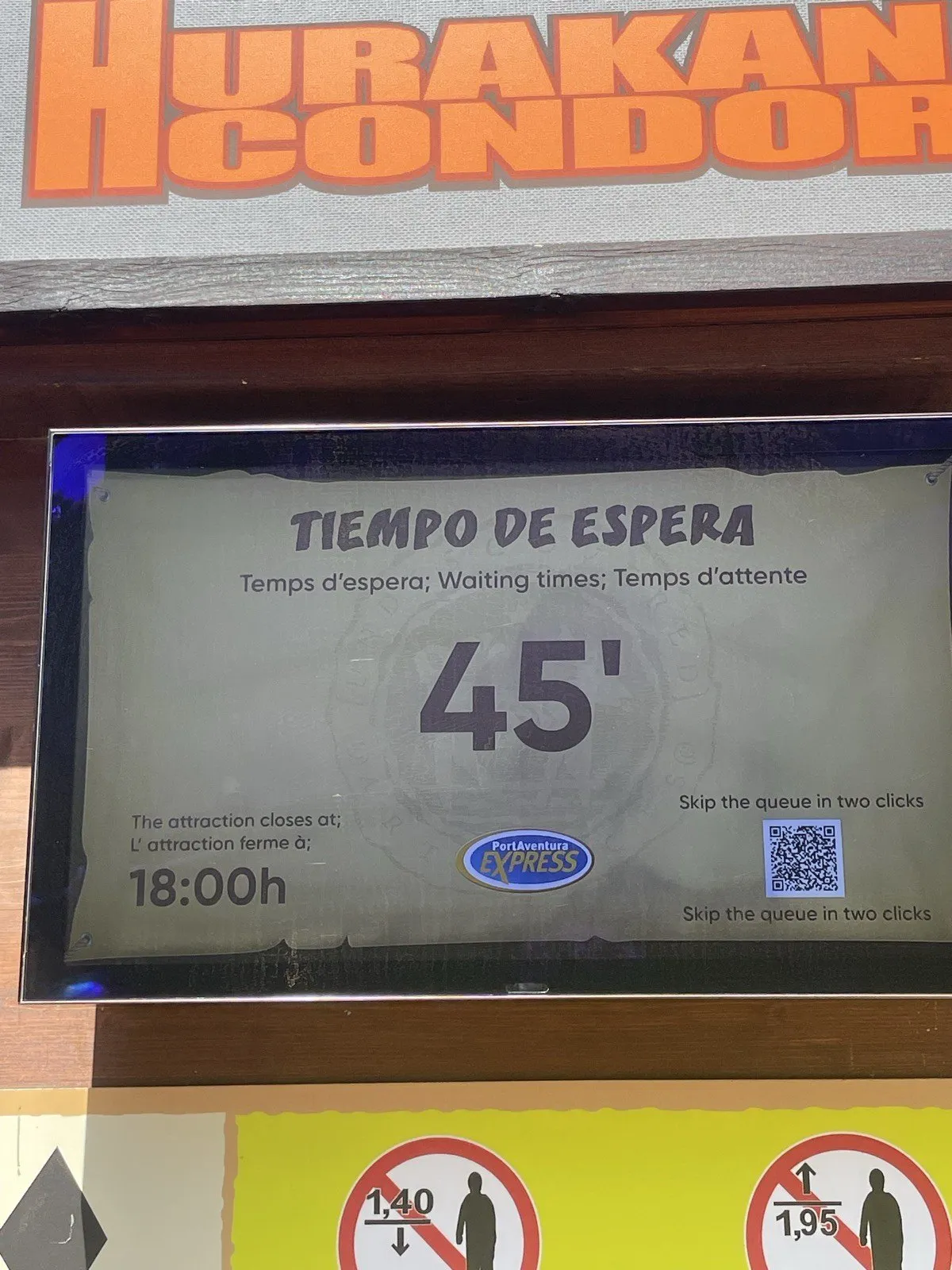
Of everything I’ve designed at PortAventura, this is the project I feel most mine: I was there before the first wireframe, and I’m still the one who goes down to the park to see how the screens are doing.
What I’d do differently
I’d make design QA part of the contract. My engagement ended at handoff, so no designer stayed with the build. The animations, the type scale and a few layouts drifted in development, and some of that debt was still there when I came back.
I’d test on the real screen, in its real place, before launch. Installation dates meant we only ever tested on provisional screens that looked like the final ones, and the code went straight to production. Some of the scaling problems only showed up once the real screens were in the park.
And I’d ask for the device specs before designing any motion. The development company never passed on that the screens ran an old Chromium without modern animation support, so the animation package we designed was only half built. Fixing it was one of the first things I did when the project became mine.
Next on my list is a screen I’ve designed but not shipped yet: on busy days, the ride screens would suggest the time of day with the shortest expected wait, to spread guests across the day as well as across the park.
- 8area themes, each with its own typeface, background and artwork
- 4languages on every screen at the same time
- 3formats, from 24-inch ride entrances to 75-inch totems